An histogram is using to represents cuantitative data distributions using a bar plot with no spaces between the columns. In this plots, each bins (intervals) in the frequency distribution is based on the range of values that the bin contains.
In this examples well core data is used, porosity and permeability from Volve field. The histograms cab be created using R base hist() function and using third packages like ggplot2.
First, the data is loaded from a CSV file
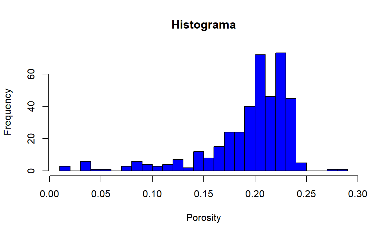
Using hist() function, we can plot a basic histogram and setting some options like color, tittle, label, axis type, number of bins, etc. We can add a tittle and axis labels.
hist(core_data$POROSITY, col = "blue",
     xlab = "Porosity", main = "Histograma", breaks = 30)
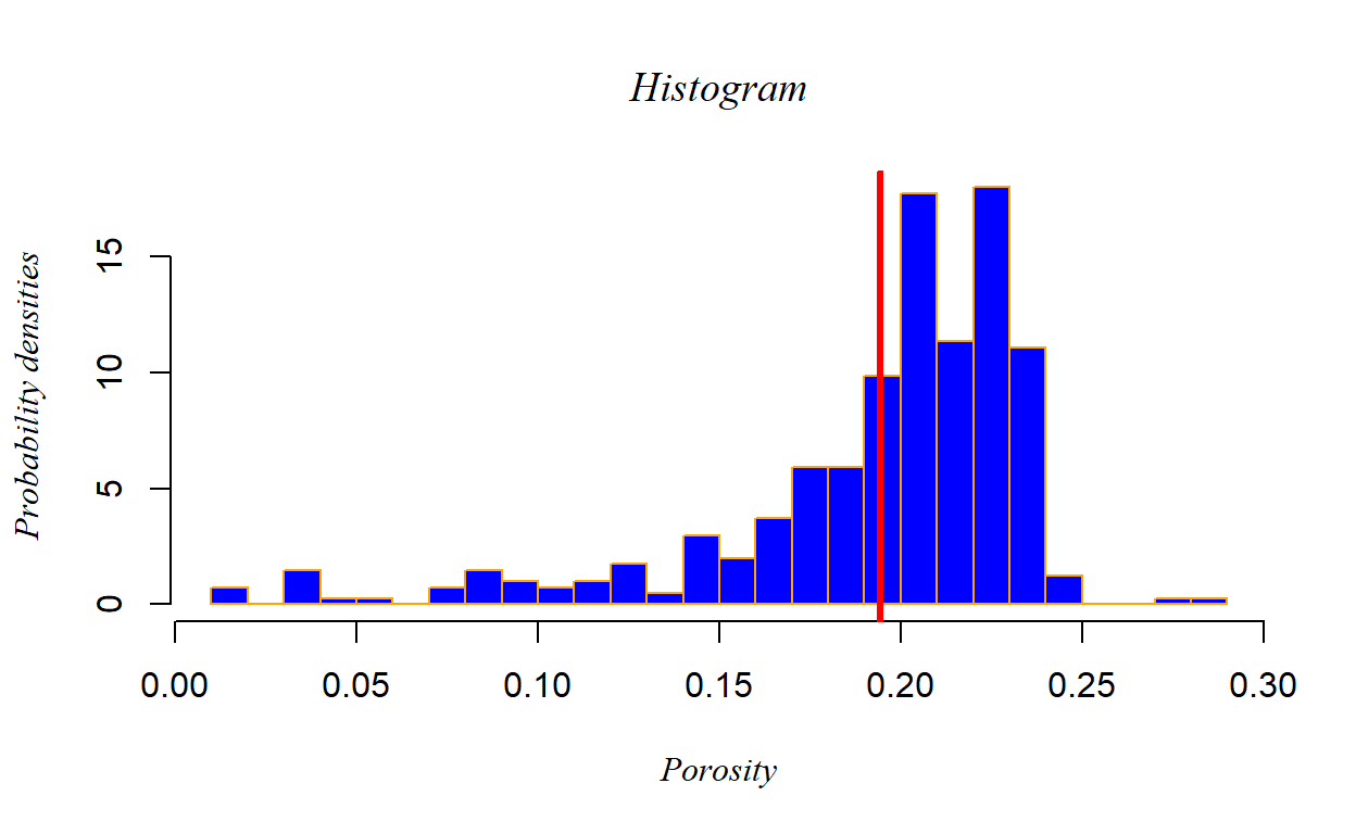
To show probability densities in place of frequency we can change the “freq” arguments to FALSE, besides, we can add a vertical line to indicate any other data like porosity mean using abline() function. Also, the plot has more visual options like font type and bar border color.
hist(core_data$POROSITY, col = "blue", freq = FALSE,
     xlab = "Porosity", ylab = "Probability densities",
     main = "Histogram", breaks = 30, font.lab = 8, font.main = 8,
     border = "orange")

abline(v = mean(core_data$POROSITY, na.rm = TRUE),
       col = "red", lwd = 3)
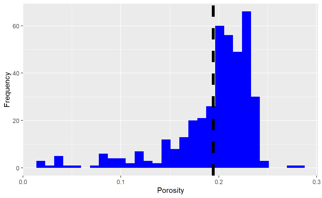
According to ggplot2 layers, first we have to define Data as an argument on ggplot function, and then, in the same function, the aesthetics, using aes() function, the scales on which we map our data, we can define x-axis, y-axis, colour, fill, size, shape, alpha, line type and line width.
After that, the geometry layer is defined according the visual elements used for our data, in this cases the function geom_histogram is used, the vertical line is defined with geom_vline function. Finally, the coordinates layer can be setting, like axis labels. ggplot2 has other layers like Facets, statistics and themes, to configure more complex plots.
library(ggplot2)

ggplot(data = core_data, aes(x = POROSITY)) +
    geom_histogram(fill = "blue", bins = 30) +
    geom_vline(aes(xintercept= mean(POROSITY, na.rm = TRUE)),
               color="black", linetype="dashed", size=2) +
    xlab("Porosity") +
    ylab("Frequency")
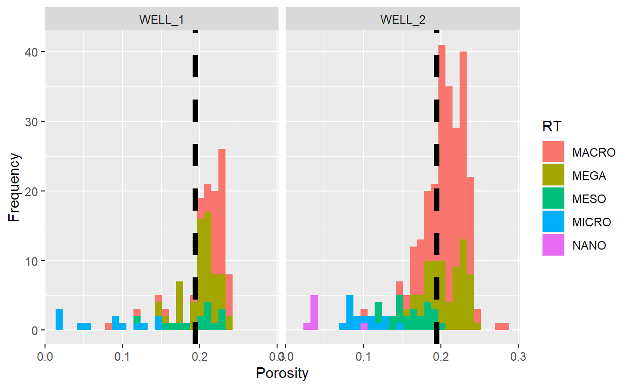
Using ggplot2 we can mapping the data using other variable in the dataframe, in this example the RT (Rock Type) variable is the rock type in every observation, computed using winland R35 equation. In the case of histogram, this variable have to be categotical o factor.
ggplot(data = core_data, aes(x = POROSITY, fill = RT)) +
    geom_histogram(bins = 30) +
    geom_vline(aes(xintercept= mean(POROSITY, na.rm = TRUE)),
               color="black", linetype="dashed", size=2) +
    xlab("Porosity") +
    ylab("Frequency")
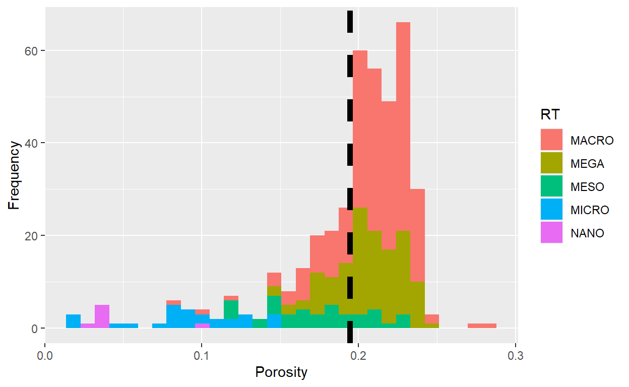
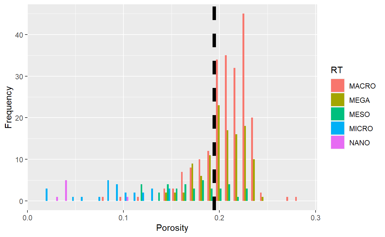
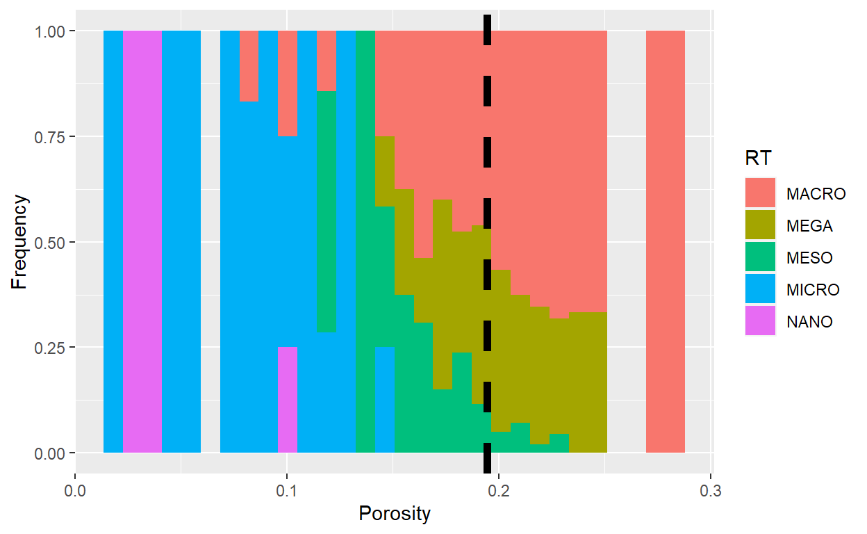
Other attribute in histogram is the position, we can set the bars in 3 forms: “stack”, “dodge” and “fill”, the fisrt is the default. the second separate the columns side by side and the last, fill the yaxis to show the proportion from the total in every interval.
“dodge”
ggplot(data = core_data, aes(x = POROSITY, fill = RT)) +
    geom_histogram(bins = 30, position = "dodge") +
    geom_vline(aes(xintercept= mean(POROSITY, na.rm = TRUE)),
               color="black", linetype="dashed", size=2) +
    xlab("Porosity") +
    ylab("Frequency")
“fill”
ggplot(data = core_data, aes(x = POROSITY, fill = RT)) +
    geom_histogram(bins = 30, position = "fill") +
    geom_vline(aes(xintercept= mean(POROSITY, na.rm = TRUE)),
               color="black", linetype="dashed", size=2) +
    xlab("Porosity") +
    ylab("Frequency")
Also, we can use Facets layer to generate small multiples plots using a variable.
ggplot(data = core_data, aes(x = POROSITY, fill = RT)) +
    geom_histogram(bins = 30) +
    geom_vline(aes(xintercept= mean(POROSITY, na.rm = TRUE)),
               color="black", linetype="dashed", size=2) +
    facet_grid(.~ WELL) +
    xlab("Porosity") +
    ylab("Frequency")